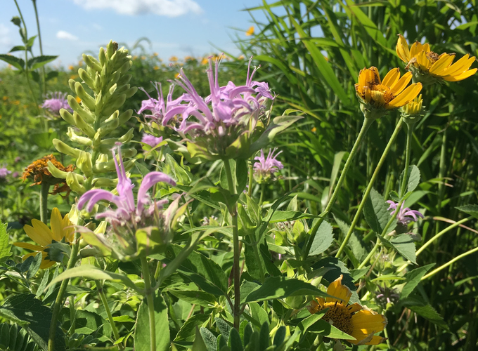
I’ve been inspired by other R packages that have created color palettes based on living organisms. Naturally I decided to try to make a color palette using prairie species. I want to note right away that I didn’t do anything fancy when choosing colors. I merely used the instant eyedropped tool to hover over different pixels in my photos and wrote down the hex codes. Obviously colors will vary based on lighting and shading. I had to be a little arbitrary in picking the essential pixel shades. Most of these photos can be found in my gallery. If a photo is taken from somewhere else (i.e. is not my own) then I’ve noted it as such.
For all the botany nerds out there I’ve decided to grab colors from two species in 4 different families. There are obviously WAY too many beautiful flowers to choose from. This is merely a starting point.
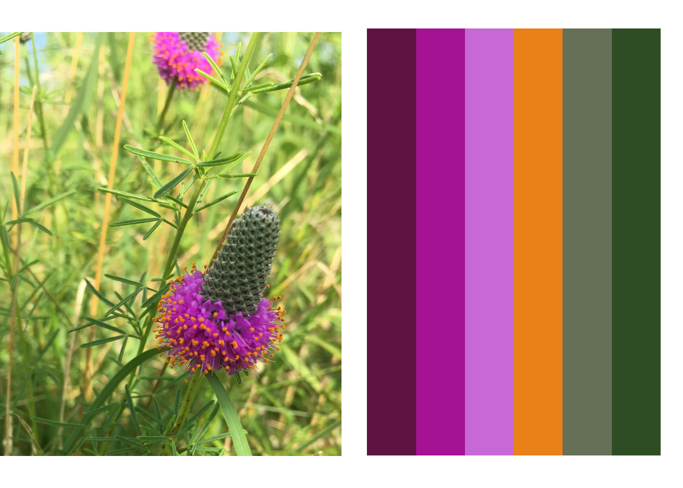
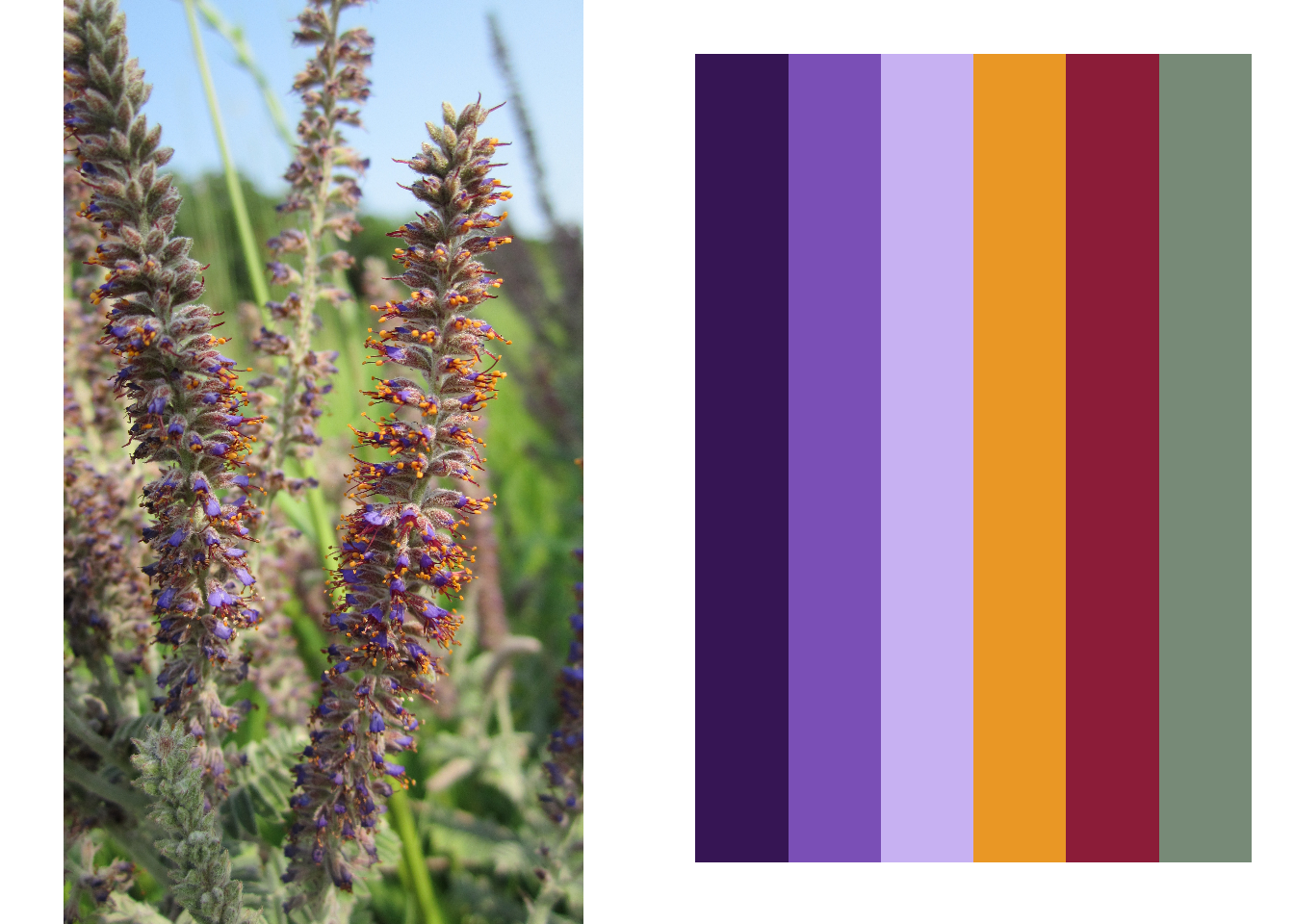
i. The bean family (Fabaceae)
I started with Purple Prairie Clover (Dalea purpurea), which was an obvious choice for me since it has a lovely contrasting purple/orange color profile.
I moved onto Leadplant (Amorpha canescens) which has a similar color palette to purple prairie clover. Predominantly purple flowers with orange anthers. However, leadplant also has beautiful red stamens and the overall color of the plant is a lovely gray-green. It is one of my favorite plants.
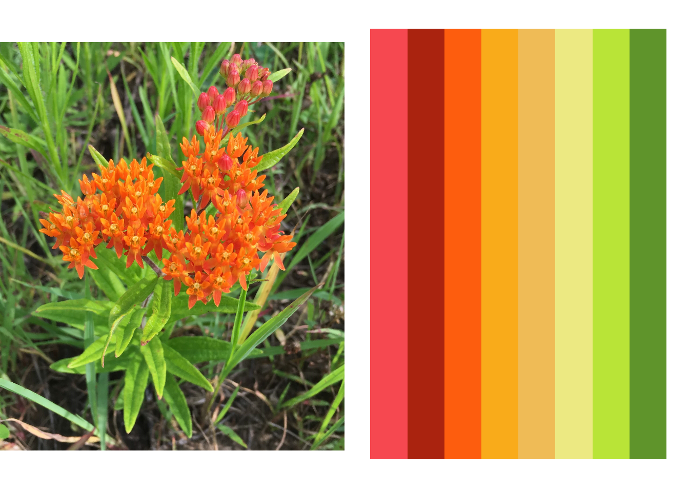
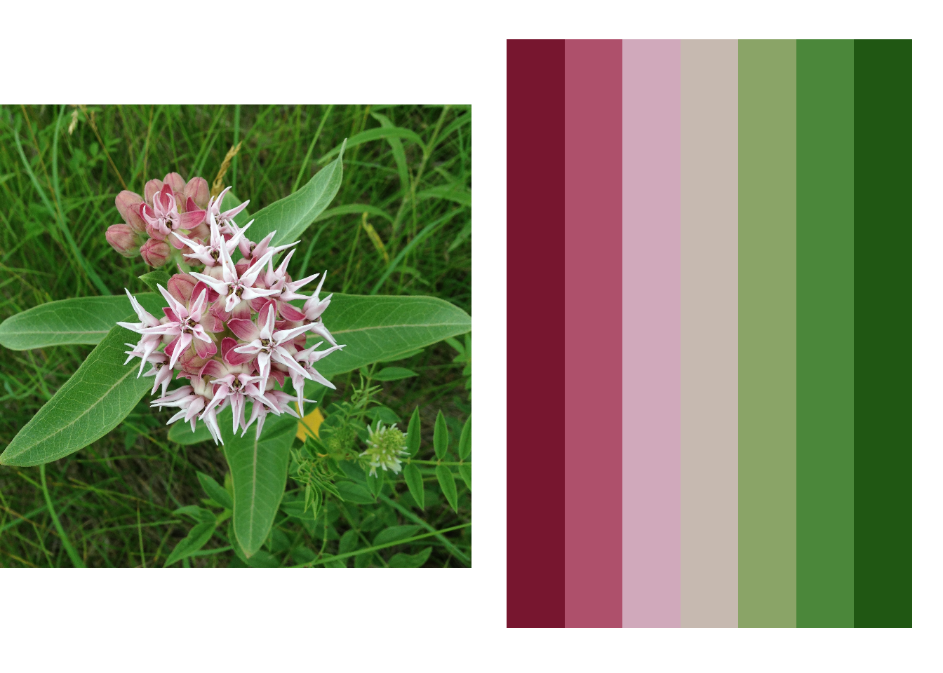
ii. The milkweed family (Asclepiadaceae)
Milkweeds are becoming increasingly popular in prairie restorations due to the fact that they provide essential forage and habitat for Monarch butterfly larvae. Butterfly milkweed (Asclepias tuberosa) is one of the few orange prairie flowers. I was actually able to grab a lot of colors from this photo since, for instance, the budding flowers have a nice coral hue and the inner flower structure is creamy yellow. This palette is also a lot louder than the other two - hello bright and beautiful orange!
I thought I should do another milkweed, so I chose showy milkweed, which has a more color palette that is more similar to the common milkweed we all know. Showy milkweed is just more, well, showy than the common variety.
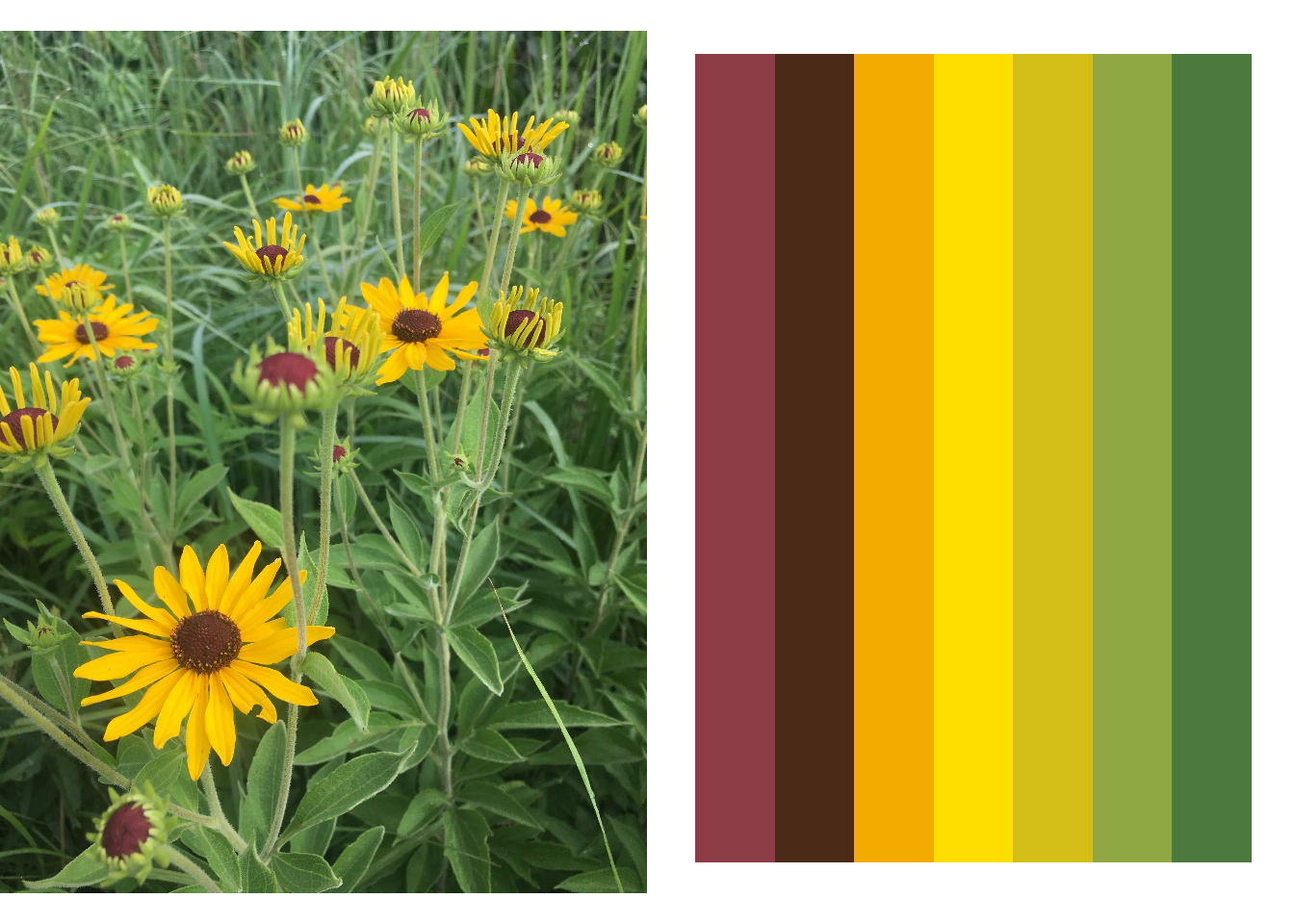
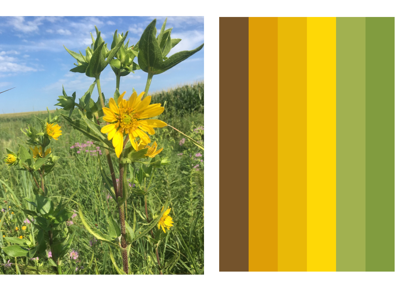
iii. The daisy family (Asteraceae)
I knew I had to make some color palettes from species in the Asteraceae (Daisy) family. After all the Asteraceae is a HUGE plant family. I started with sweet coneflower (Rudbeckia subtermosa), which is related to brown- and black-eyed Susan. I love the brownish red color of the inner disk florets.
The other asteraceae flower I chose was Rosinweed (Silphium integrefolium) which has a more traditional sunflower appearance (although it is not in the sunflower genus Helianthus).
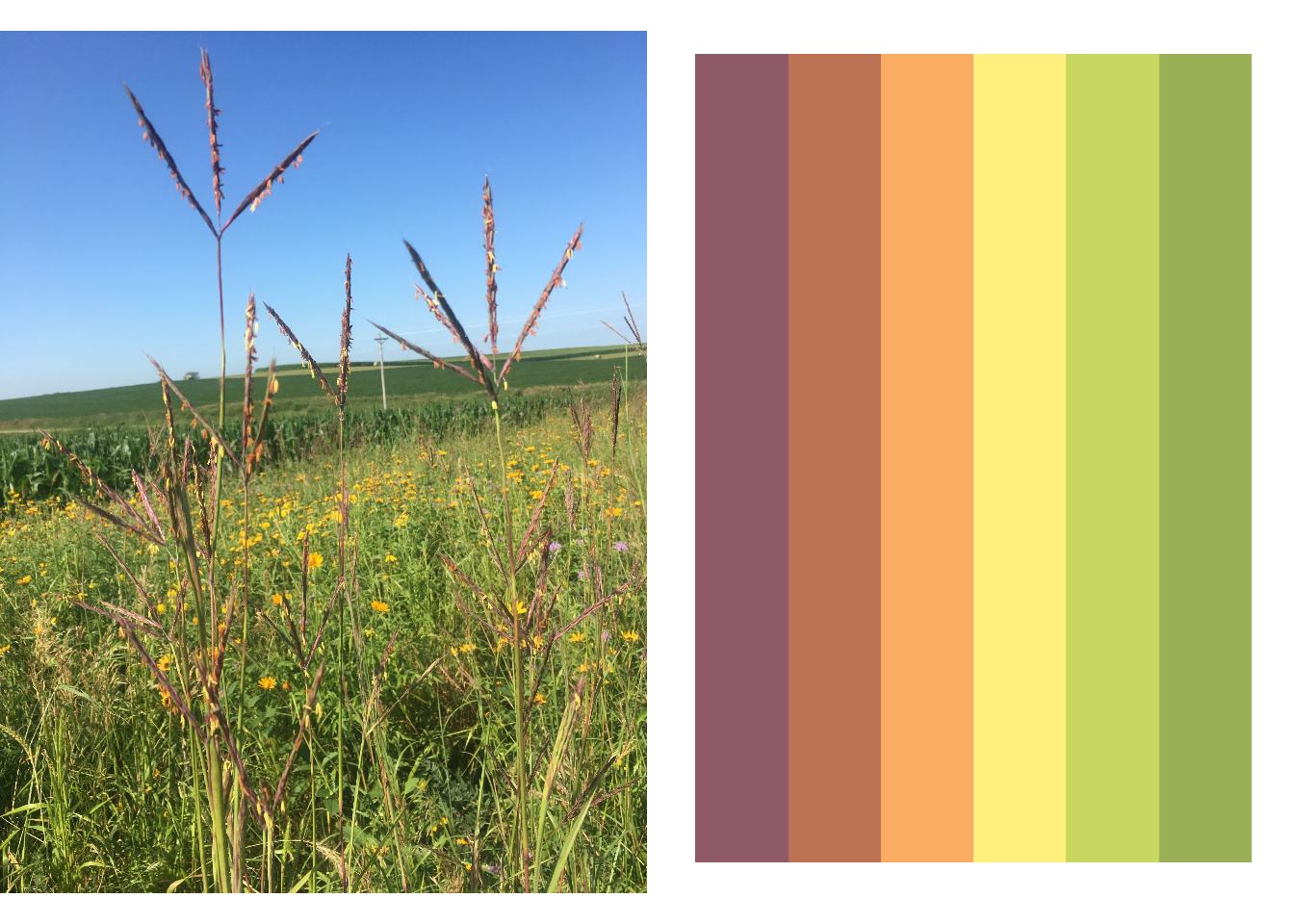
iv. The grass family (Poaceae)
Grasses flower too!
Big bluestem is arguably the most quintessential of the prairie plants. It’s one of the plants that gave the tallgrass prairie the “tall” part of its name. It easily dwarfs me (a meager 5ft I might add) by mid summer. It’s also commonly called “turkey foot” because of the way its inflorescences are structured. The inflorescences are a maroon-purple color and anthers are both orange and yellow. There is also orange on the stem, often near the nodes. I found it interesting that this color palette is similar to Sweet Coneflower’s but is just naturally more muted.
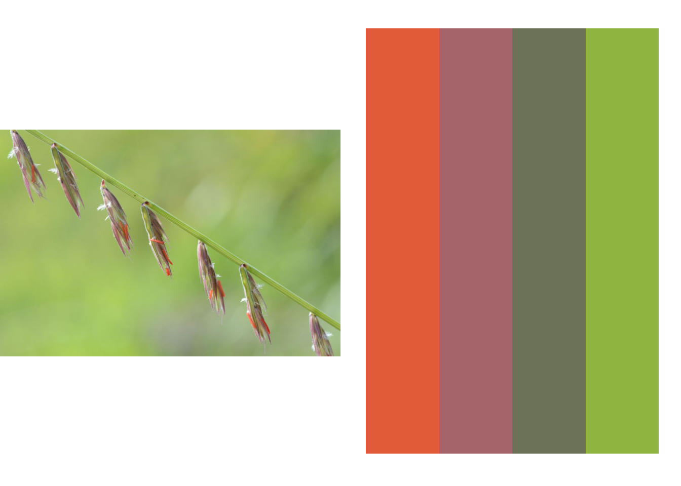
Side oats grama grass (Bouteloua curtipendula - one of the funner scientific names to pronounce I may add) is a shorter grass species that has a lovely spike of florets that hang down along one axis. I haven’t gotten a good photo of side oats while it’s flowering so I snagged a photo from Prairie Moon Nursery’s website. When flowering, side oats has some beautifully red anthers and pollen.
Next steps:
This is all well & good and has been fun for me BUT it’s important to note there are some things I haven’t done that seem like good ideas to continue this project…
- Check for color blindness. The side oats palette especially (red! green!) seems like it wouldn’t be appropriate for multiple forms of colorblindness but I need to run my colors through a check to be sure of which color combinations are robust or not.
- Create qualitative, sequential, diverging, and accent scales. Some of these palettes already would function well in that regard, but I need to make a more concerted effort to ensure every type of color palette is available to the user.
- Put these colors into an R package so others can easily use them! I’m open to name suggestions…