In my last post, I had some fun and made prototypes of color palettes based on off prairie plants. If I ever get around to making these color palettes into something more, like a package, I’d want to ensure they are color-blind friendly.
This led me to try out Claire McWhite and Claus Wilke’s package colorblindr on my palettes. One of the functionalities of colorblindr is that it can display plots as they would appear to a colorblind person. The package wasn’t on CRAN at the time of this posting, but you can download it from github (FYI at the time of this posting I couldn’t get the package to download on my computer (?? idk) so I cloned it from github and built it on my own device)
For the sake of this blog post I wanted to view my original palette next to the colorblind version of the palette. I focused my efforts on making sure my palettes would work for red-green colorblindness (Protanopia/Deuteranopia) since those seem to be the most common forms of colorblindness. Therefore I edited the cvd_grid function to only display those two grids.
Here’s how my color palettes look:
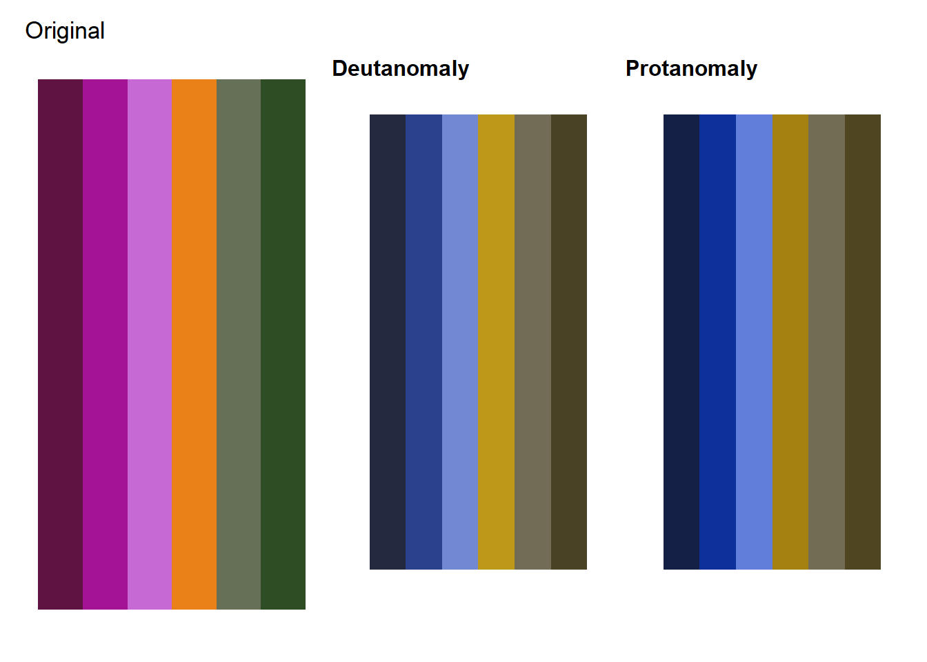
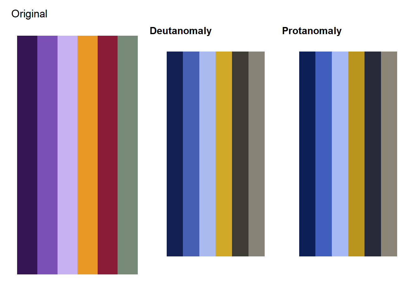
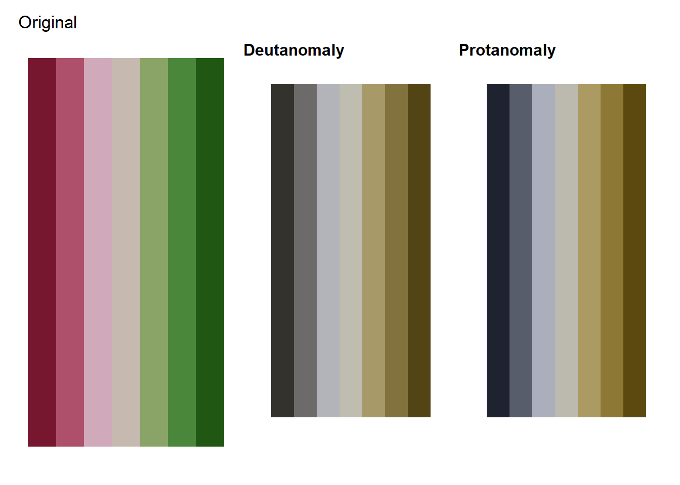
These first two palettes, which are based off of plants in the bean family and are more discrete in nature seem to be OK for colorblind folks. Cool!
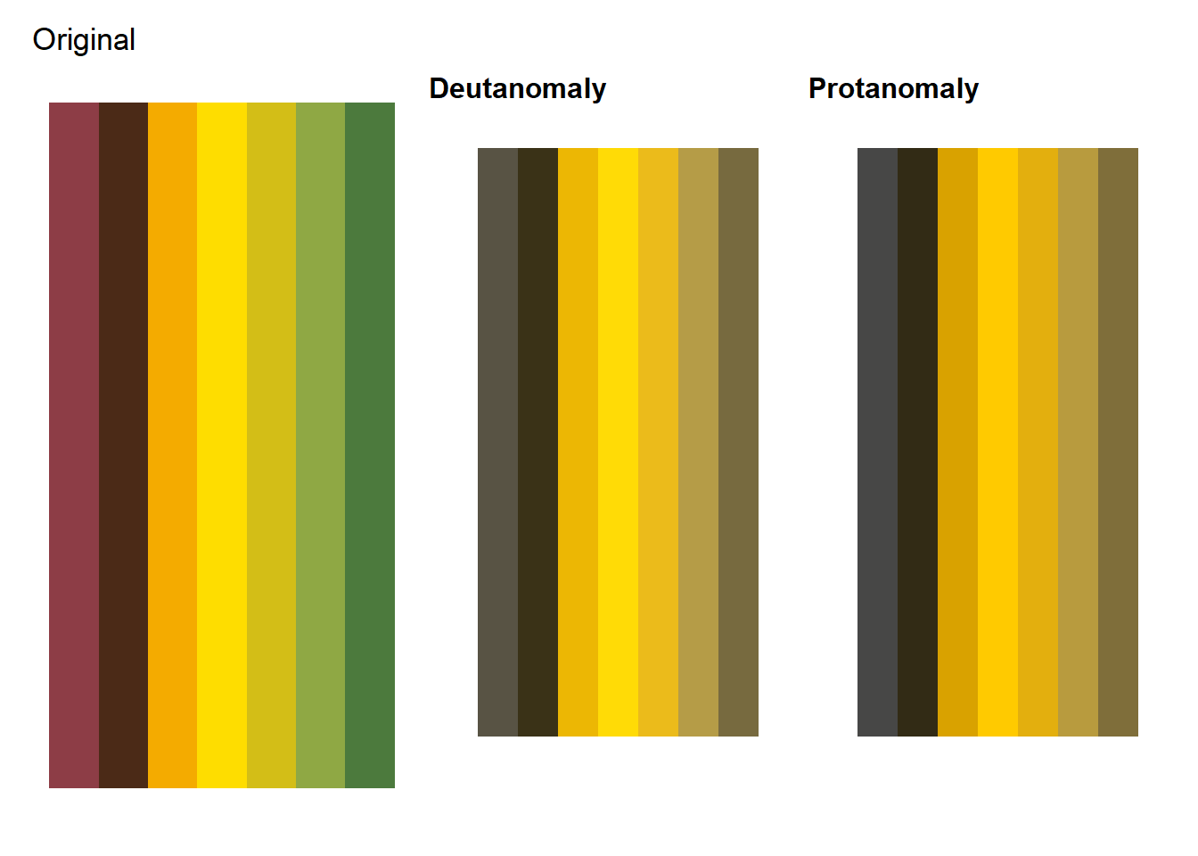
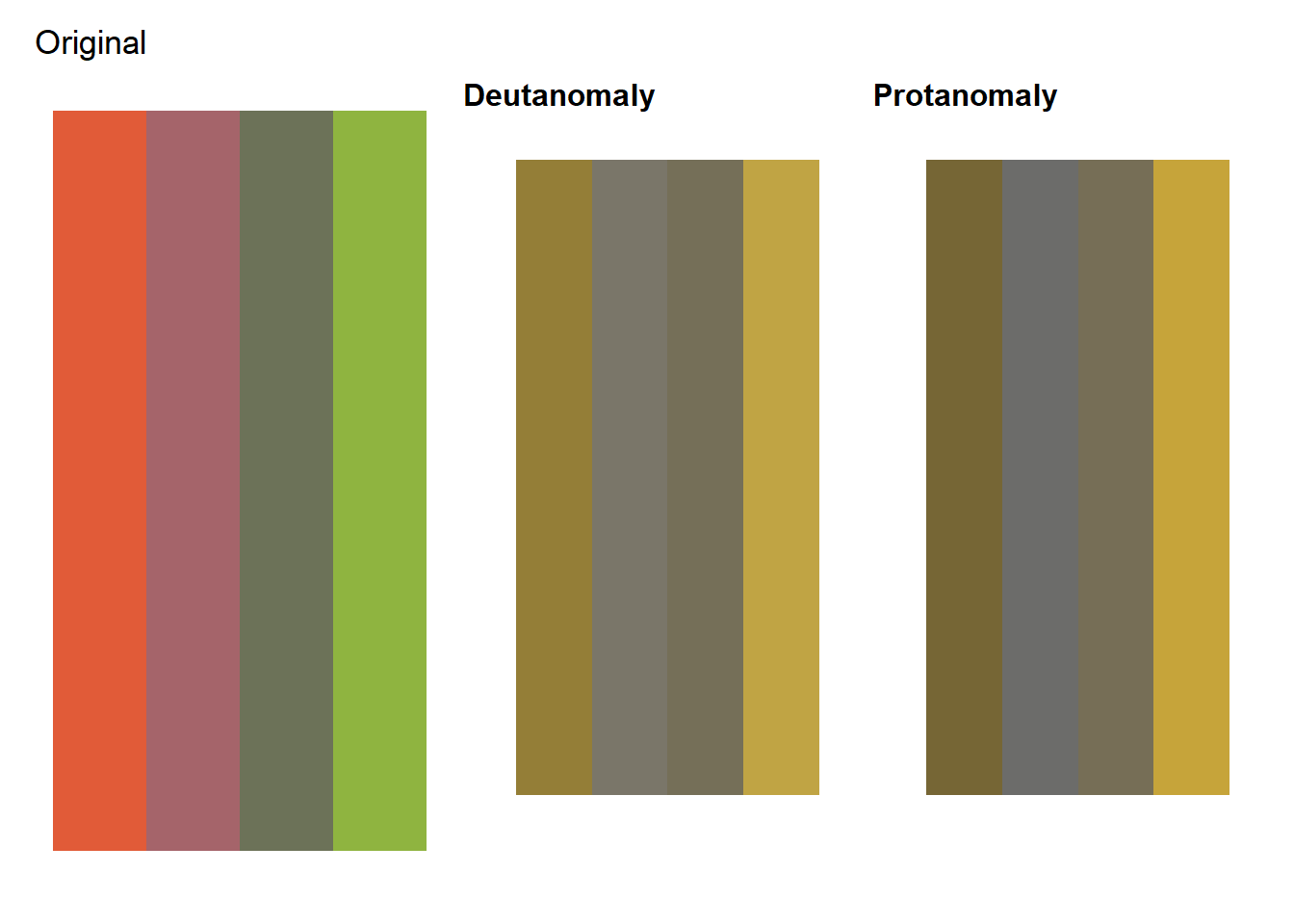
 This butterfly milkweed inspired palette is less than optimal in colorblind vision. The light green and light orange seems problematic - it shall be altered!
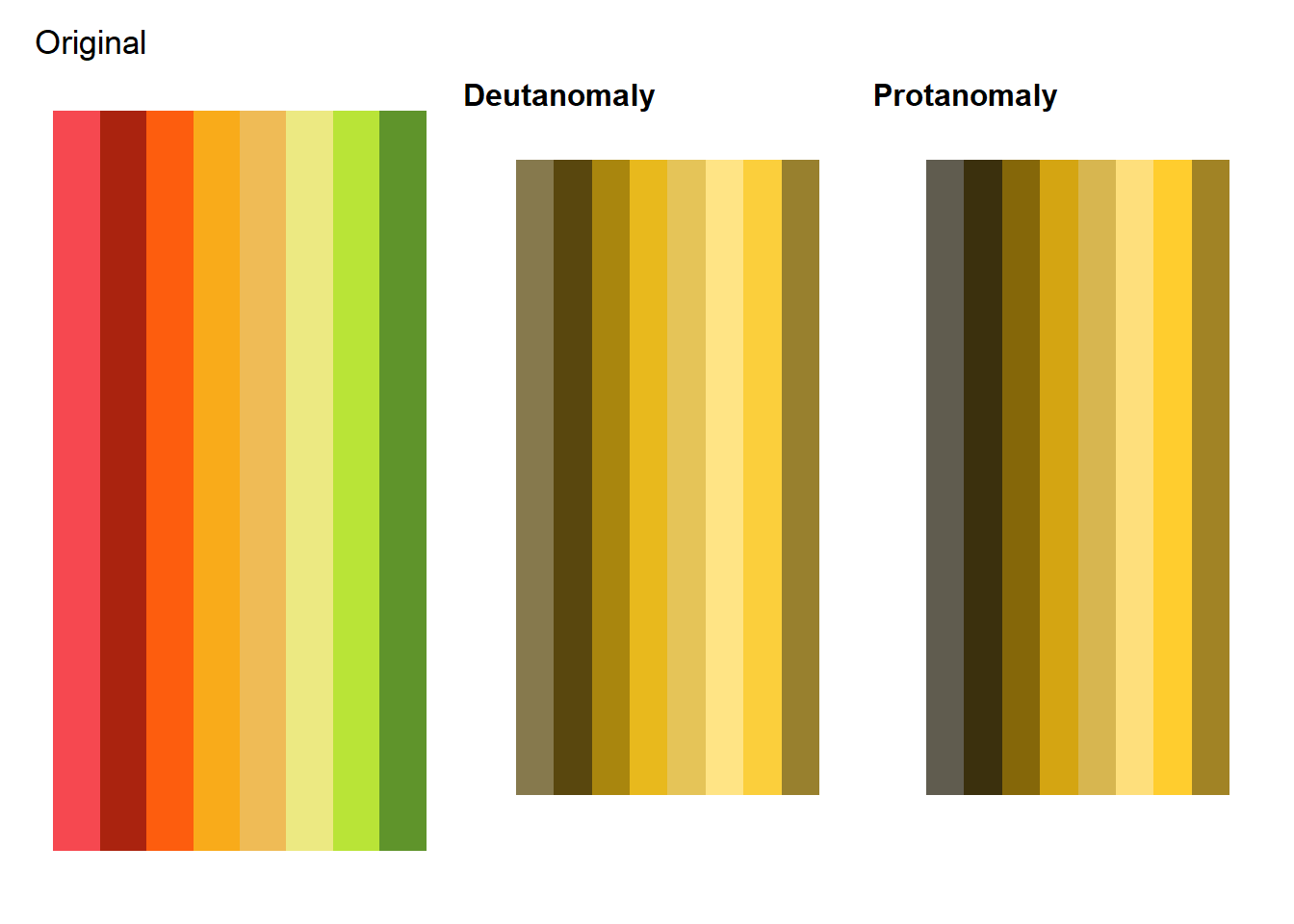
As a sequential palette, the showy milkweed seems OK! The light pinks are a little hard to differentiate, but they are also kind of hard to differentiate for a non-color blind person.
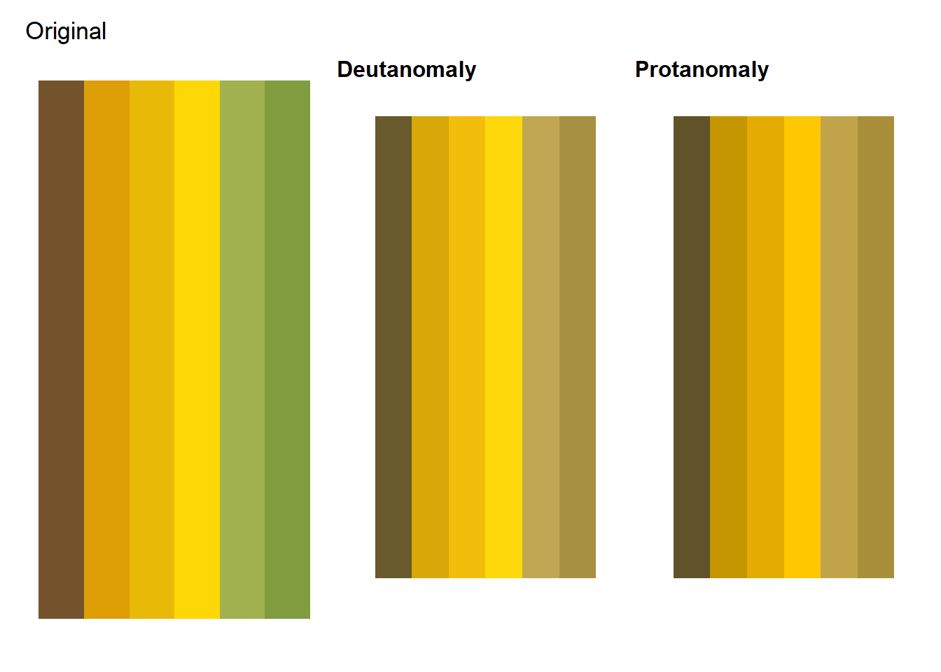
This sweet cone-flower palette was originally my favorite, but similar to the butterfly milkweed palette above, the light orange and green are hard to differentiate. Perhaps I’ll make this a discrete palette instead of sequential…
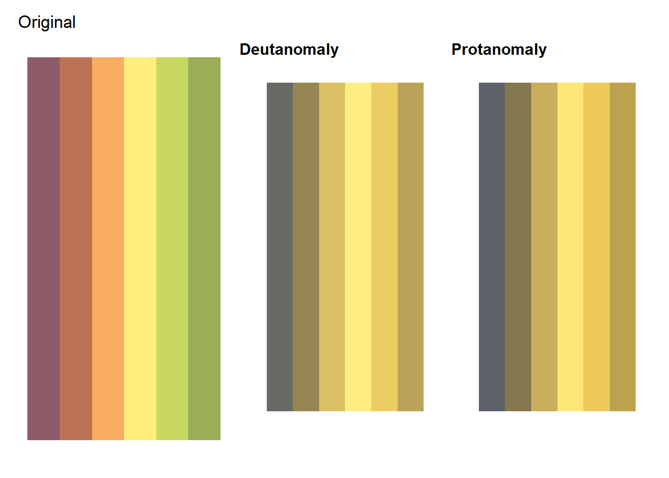
While I love the idea of there being a sunflower palette, I’m not sure if this works. Also, yellow doesn’t usually show up well on project screens, especially on a white background.
Surprisingly the first of the grass palettes looks decent.
I had no hopes for this palette since it is based on red and green. It’s honestly better than I was expecting but still not good enough to export into a package. Oh well!
Using colorblindr has given me some good insight into which colors don’t work well in the same palette (mostly oranges and greens). As I move forward with this project and create any new palettes I’ll make sure to continue to use it.